Muted Colors – Learn Everything There Is to Know About Muted Tones
This post may contain affiliate links. We may earn a small commission from purchases made through them, at no additional cost to you.
Color is all around us, impacting our lives in many ways. From our eye color to the color of our hair and our skin. Or even the immense number of colors found in nature, from the green grass to the blue sky. Color surrounds us! In today’s digital world muted colors play a pivotal role, but you wouldn’t think to refer to them as dull. Muted colors (also referred to as desaturated colors) are rather seen as a way to bring a painting to life conveying feelings and moods. We have put this article together to explore all aspects of muted colors, and the roles they play in art, and exactly what is a muted color.
Table of Contents
What Is a Muted Color?
You might be wondering what exactly a muted color is. Muted makes one think about unassuming and quietness. Muted colors are dull and desaturated colors. Color saturation refers to the intensity and vibrancy of a color. The more muted a color, the less intense it is. A grayed or subdued color would be a desaturated color in art. Think about the comparison of the colors of a sunny day with the colors of a snowy or rainy day. The colors are all quite different, but do not think that the muted colors associated with a rainy day are not as important as the colors of a summer’s day in terms of art.


The Psychology of Color
The Ancient Egyptians, more than 5000 years ago, were the first to study the impact that colors have on mood. Several thousand years later, in the late 1600s, Sir Isaac Newton discovered the color spectrum and how it is composed. It was, however, Carl Jung, who is known to be the pioneer of color psychology. Carl Jung had a great interest in the properties and meaning of colors, and their potential of art for psychotherapy.
The primary colors within psychology are blue, red, and yellow. They each represent emotions, mind, and body, as well as the interdependence and harmony shared by the three elements.


In addition, it is from just these three colors that all other colors are created, yet you are not able to create these three colors by mixing other colors. Regardless of whether colors are in their soft, gentle, muted tones, or their saturated, purest form, all colors are said to contain symbolic meanings.
The Symbolism of Color
When creating art, a powerful tool in your arsenal is to create a picture with the use of symbolic colors. As an artist, we can create certain responses from our viewers when we use particular colors. While at the same time you can convey a message to the viewer through colors’ symbolism.
Depending on what color you choose to use, you can create both a positive or negative message.


Primary colors are not the only colors that have particular meanings. You do not only find symbolism in colors that are vivid and saturated. You can evoke powerful emotions when using a desaturated color palette. Just because a desaturated color is muted and duller, does not mean that they will only evoke melancholic and introspective moods in viewers.
Black
The color black plays an important role in the desaturated color palette. More often than not, black is associated with morbidity, sadness, and grief. It can also evoke feelings of secretiveness and mystery, while also offering levels of sophistication and dignity.
Black is thought to be a masculine color in the art world. Be careful when working with the color black, as it can overshadow all the other colors in the composition.


Blue
Blue is thought to be the most popular color in the world. It is the color of the sea and the sky above us. Blue evokes feelings of honesty and openness. In both life and art, blue is associated with good character, wisdom, and trust.
Blue does have another side to it, one of sadness, despondency, and melancholy. This is where the term, “having the blues”, comes from. The painting will be moodier the darker the blue is. Blue, therefore, plays a large role in a desaturated color palette.


Brown
Brown comes to the top of one’s mind when thinking of muted colors. Brown is an earthy tone, found in nature in abundance. It is thought of as the most restful color in the color spectrum. If your painting is primarily made up of dull colors, brown forms a feeling of warmth and earthiness. Brown is seen as a cooler color when used on a brighter palette.
The old masters such as Titian, Rubens, and Rembrandt were known for using the color brown widely.
In the famous Van Gogh painting, The Potato Eaters (1885), the composition is primarily made up of greens and browns. Van Gogh described the painting as, “Something like the color of a dusty potato, unpeeled of course.”


Gray
Gray is another commonly thought of muted color. Muted colors can also be referred to as “grayed” colors. Gray offers a feeling of peace and provides a symbol of caution and restraint. You can create different shades of gray by combining a secondary color and a primary color that are complementary (like orange blue, red and green, or yellow and purple).


Green
Green evokes feelings of new creation, and growth and is considered the color of nature. There are so many different tones of green, and the more muted the tone of green, the greater effect it has in calming a viewer.
It is a peaceful and gentle color, in particular the desaturated, paler versions of green.
The green which was used in Van Gogh’s The Potato Eaters (1885) is more of an olive-colored green, which is a classic muted color that is both moody and peaceful at the same time.


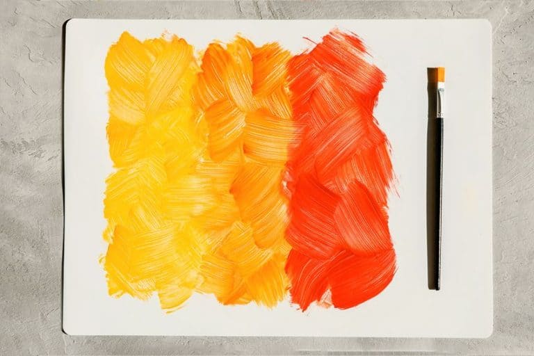
Orange
Orange is a vibrant, lively color that is linked with youthful fearlessness and spontaneity. It causes the brain to be stimulated with positive mental activity. The more desaturated and darker the orange, the more dominant and aggressive it is. It is because of this that you need to take care when using orange in your composition that is composed predominantly of muted colors.


White
It can be argued that white can be thought of as either a color or the complete absence of color. In this article, we will consider white as a color and as a color that is associated with freshness and purity. White can be used in art to lighten or tone down other colors. Images of ice and snow come to mind when we think of the color white. However, if you are painting a snowy landscape try to use white sparingly as it can create a clinical feeling.
White can make other colors seem lifeless within a composition. Also keep in mind that in certain cultures, white, as opposed to black, is considered the color of grief, unhappiness, and death.


Purple
By combining the two primary colors, blue and red, you create purple. Purple is considered a luxurious and regal color, particularly the darker shades of purple. You should be careful when using purple, as it can cause feelings of despondency and sadness, especially if the color black has also been used in the same painting. In a dull color palette, the shades of purple, such as lilac, lavender, and mauve, which are more muted and lighter, are considered more forgiving on the eye and work great in conjunction with white and gray.


Yellow
Yellow, as you are aware, is one of the three primary colors. It symbolizes warmth, light, sunshine, and evokes feelings of hope and happiness in viewers. It is a “summertime” and optimistic color that gives off the positive feeling that all is right in the world. You are not able to make yellow by combining other colors, but it can be mixed to form more earthy tones.
Historically, landscape painters used desaturated yellow to give a feeling of melodrama and romance in their paintings.


Red
As a dynamic color, red evokes feelings of excitement, power, love, and strength. As red can also be considered dangerous, it should be used with care. Red as a color flatters the skin, so it is often used in portrait paintings. You get the feeling of warmth and peace when using light reds and pinks.
Deeper reds cause feelings of power and opulence. Much like the color orange, muted reds need to be applied with care in composition. Otherwise, you run the risk of overpowering the other colors, particularly if the other colors used are muted.


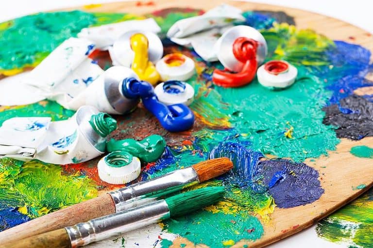
How to Paint Using a Muted Color Palette
The father of impressionism, Claude Monet, once said, “Color is my day-long obsession, joy, and torment.” When you view paintings, you will note that many of them are created using muted tones. Of course, this does not apply to all paintings, as some are composed of vibrant, bright colors but are offset by duller colors.

 Water Lilies (1906) by Claude Monet; Claude Monet, Public domain, via Wikimedia Commons
Monet was aware, as most artists are today, that if you have completed your whole painting using very saturated, vivid colors, you do not create a focal point in your painting. Any focal point will be overshadowed by all colors that surround it, as each color fights to stand out more than the other colors. Viewers will struggle to know where to look, and the competing colors will seem jarring to their eyes.
On the other hand, if your base colors are made up of a dull color palette, you will have better control over your focus point and where your eye is drawn.
If your focus point is predominantly made up of unsaturated colors, and is then surrounded by vibrant, brighter colors, the focus point will stand out more. It is, therefore, better to occasionally use brighter tones, combined with muted and desaturated tones.
Creating a Muted Palette
Muted colors, which are also referred to as dull colors, are made up of a desaturated palette. If you want to create a muted color, you can tone down color by simply combining it with gray. Another option is to use some black, however, this will cause the color you are mixing to darken. Alternatively, should you wish to lighten the color, you can mix it with white.
Some artists create a desaturated color palette by combining color with its complementary (or opposite) color, such as blue and orange, or purple and yellow. When viewed side by side, the complementary colors provide a strong contrast. However when they are mixed, they form a grayscale color and in doing so, they cancel each other out.
You can also create a muted palette by using earth tones. An earth tone is a shade that contains some brown, much like the color of the soil. The term also covers natural colors like the vibrant red of the sun, stormy gray sky, rich brown soil, and crisp green leaves. You would also find a dark slate blue or a dull purple in a muted color palette.


You can also consider a cool gray as a muted color. Pantone’s Color of the Year for 2021 included “Ultimate Gray”. This particular color can be associated with cleanliness and minimalism and gives the viewer a feeling of relaxation and calmness.
If you are creating a muted palette yourself (and not doing it digitally), is not an exact science. You will achieve different results for every two colors mixed, all dependent on the ratio of colors you are combining and each color’s saturation. You will require different colors for each painting you do.
To achieve the results, you will have to experiment with the saturation of the colors and the ratio until you create the color palette you are looking for.
Analog vs Digital
If you are one of those people who prefer working with a pen and paper as opposed to capturing your thoughts on a digital device, you will know that supplies such as pencils, pens, and notebooks are available in an assortment of colors. Often, journalers will prefer to use colored ink as opposed to black ink, as the results are more visually appealing. From a psychological standpoint, bright colors are energizing and uplifting, and are easy on the eye.


On the other hand, digital devices are available in more muted colors such as gray, silver, white, or black. Regardless of whether you use a Windows or an Apple Mac application on your device, the screen colors are muted and quiet, such as dull-white, grays, and soft blues that will not tire your eyes out or cause screen fatigue.
As the popularity of muted colors grows, they also impact other areas of society from advertising, fashion, and marketing, to music. A muted color scheme emotionally impacts people, as they are considered contemporary and modern.
This is because brighter colors, in terms of the digital world, are thought to be ineffective and archaic now, and are not ideal for use on devices as they put the eye under a lot of strain. As digital devices play a huge role in our day-to-day lives, providing us with the tools for Zoom meetings, online education, and working from home, you in all likelihood will have seen the following terms for color types: PMS, HEX, CMYK, and RGB.
There are two possible types of digital color palettes you can create, print and on-screen. CMYK and PMS are print palettes, while RGB and HEX are onscreen palettes. With these palettes, you can create an array of digital art with an assortment of muted tones.


We have put together a table of the most well-known HEX and RGB colors in terms of muted colors. You can also utilize these colors to create further muted colors. You can use any of the colors in the following table and mix them with any color on the color spectrum and you will be able to create muted colors.
| Color | RGB Code | Hex Code | Shade |
| White | 255, 255, 255 | #FFFFFF | |
| Black | 0, 0, 0 | #000000 | |
| Light Gray | 231, 230, 230 | #E7E6E6 | |
| Dark Gray | 165, 165, 165 | #A5A5A5 | |
| Light Brown | 153, 102, 51 | #996633 | |
| Dark Brown | 102, 51, 0 | #663300 | |
| Light Green | 51, 204, 51 | #33CC33 | |
| Dark Green | 0, 51, 0 | #003300 |
Famous Paintings with a Muted Color Palette
We won’t be able to go through all the artworks and artists where muted colors or bright colors have been used, as we would be here forever! There are, however, two artists who immediately come to mind when discussing subdued and vivid tones, namely Piet Mondrian (1872 to 1944) and Edgar Degas (1834 to 1917).
One of Mondrian’s most famous pieces is Composition in Red, Blue, and Yellow (1929). The piece is a series of bright geometric figures done in the primary colors of yellow, red, and blue. Black borders and white squares have been used to aid the colors in further standing out. This artwork is a stunning example of how best to utilize highly saturated and bright colors.

 Composition in Red, Yellow, Blue, and Black (1921) by Piet Mondrian; Piet Mondrian, Public domain, via Wikimedia Commons
On the complete other end of the spectrum, there is Edgar Degas’ The Ballet Class (1871). This piece uses gentle, muted tones to capture the scene of dancers in a room. The white of the dancer’s dresses pops against the restrained browns used for the floorboards and the soft, gentle greens used to create the room’s walls. The painting as a whole creates a feeling of quiet and peacefulness.

 The Ballet Class (1871 – 1874) by Edgar Degas; Edgar Degas, Public domain, via Wikimedia Commons
Two other paintings to consider in terms of contrasting color palettes are Vincent van Gogh’s Fishing Boats on the Beach at Saintes Maries de la Mar (1888) and James Abbott McNeill Whistler’s Whistler’s Mother (1871). Van Gogh used blue and orange as his dominant colors, with only a small amount of lime green. Van Gogh said, “there is no blue without yellow and without orange.”
Van Gogh was one of the few painters of his time who was able to successfully paint using bright colors.
In comparison, Whistler’s Mother (1871) is predominantly gray and black, with small splashes of white that can be seen in the painting hanging on the wall in the background. He also used a little muted yellow when painting her hands and her face. The subject of the painting, while painted predominately in black, stands out against the black and gray background. The painting creates a feeling of melancholy and brooding for the viewer.
We hope we have been able to dispel the concept that muted colors are dull, and rather that there is an assortment of different colors that can be used either individually, or mixed with other colors to create emotions within the painting for both the viewer and the artist. Use your color palette to its full potential and experiment in making an array of interesting muted colors.
Frequently Asked Questions
Can I Use Both Bright Colors and Muted Colors in My Paintings?
Of course you can! There are absolutely no rules when it comes to working with color. When you are working with a combination of vivid and muted colors, we recommend you make the focal piece of the painting using muted colors and surround it with brighter colors. This will result in the viewer’s eye being drawn straight to the focal point, as the brighter colors cause it to stand out.
What Is the Definition of a Muted Color?
A muted color is a color that is not as saturated as a vivid, bright color. The color has been grayed or dulled by combining it with gray, brown, green, white, or black. It does not matter what medium you are working with, some of the colors found in the palette will be the muted versions. You can always further desaturate them if required.
What Are the Most Commonly Used Muted Colors?
At the end of the day, any color found on the color spectrum can be muted by simply combining it with the colors mentioned above. That being said, the most common muted colors are the earth tones, like brown, green, and gray. White and black are also often used, with white to lighten the mix and black to darken it.