Color Wheel Tutorial – Your Comprehensive Guide to Color Theory
This post may contain affiliate links. We may earn a small commission from purchases made through them, at no additional cost to you.
Creating art involves more than just applying colors to a surface. Having a strong knowledge of color theory is essential to create high-quality artistic results – whether this is through painting, drawing, or with other media. Color theory includes an understanding of the color wheel – which colors go together and how do you apply them to create an artwork? The following tutorial is intended to provide an overview of color theory and how the color wheel works.
Table of Contents
What is the Color Wheel?
In a color wheel, colors are arranged in a circle to create a system of order. Artists can use a color wheel chart as a guide for their color compositions. Harmonies are also created with the help of the color wheel chart – the different color harmony teachings are based on it. There are many different versions of the color wheel. These depend on the subdivision of the colors into the following aspects:
- Physical
- Aesthetic
- Physiological
- Artistic
- Technical
There cannot be a color wheel that covers all perspectives and thus has general validity, since the above-mentioned aspects can differ greatly from one another. In addition to their artistic applications, color circles are also used industrially. With their help, colors and colorants can be reproduced with extremely small deviations and color variations.
The Color Wheel According to Itten
Johannes Itten, a Swiss artist, and art theorist, was born in 1888 in Wachseldorn in the canton of Bern. He quickly devoted himself to color theory and developed the color wheel, which is still the basis of art instruction in most schools today. In the color wheel according to Itten, the colors are divided into
- Primary colors
- Secondary colors
- Tertiary colors
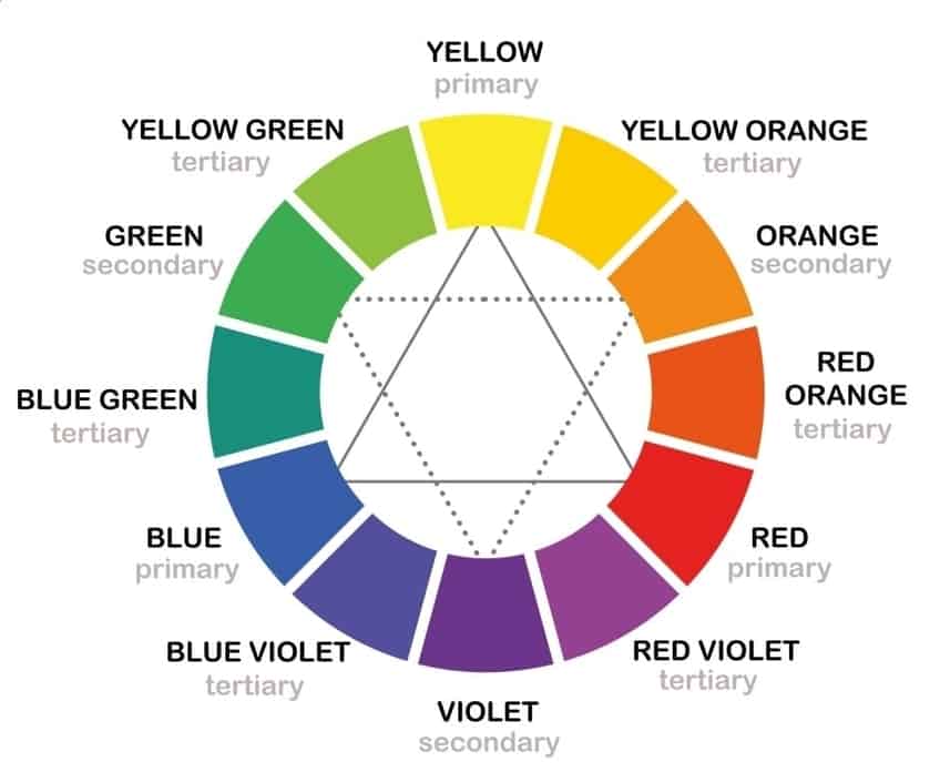
This subdivision is based on how the different colors mix. In a triangle, the colors red, yellow, and blue are represented as primary colors. The secondary colors, which can be mixed from the inner primary colors, form three further triangles in a 50:50 mixing ratio, which are arranged laterally to the triangle of primary colors. An outer circle of tertiary colors encloses the inner area and includes the primary colors again. These cannot be mixed from other colors. However, they are used for mixing secondary colors:
- Blue and red make violet
- Yellow and blue make green
- Red and yellow make orange
The tertiary colors are the following:
- Blue-violet
- Blue-green
- Orange-red
- Purple-red
- Dark yellow
- Light green

In Itten’s color theory chart, the colors are arranged between the respective primary colors and secondary colors, from which they can be mixed. The complementary colors are opposite each other in the color wheel. These are, for example, blue and orange or red and green. A mixture of two complementary colors results in gray.
The Color Wheel According to Küppers
Harald Liebedank Küppers, a printing technician born in Müden in 1928, based his color wheel chart on additive and subtractive color mixing. In addition, his theory is based on human vision. Küpper does not distinguish between primary, secondary, and tertiary colors, but between primary colors and basic colors. According to Küppers, the primary colors are based on basic human sensations. These are the following colors on his color theory chart:
- Orange-red
- Violet blue
- Green
The basic colors are all derived from this:
- Cyan-blue
- Yellow
- Green
- Magenta
- Orange-red
- Violet-blue
- White
- Black

Derivative work: McSush (talk)KüppersFarbenSonne.png: Harald Küppers, CC BY 3.0, via Wikimedia Commons
Küppers calls white and black achromatic colors. The color circle according to Küppers is, in principle, not a circle, but a hexagon, in the corners of which the primary colors are located.
Theory of Colors According to Goethe
Johann Wolfgang von Goethe was one of the most famous German poets. In addition to poetry, he devoted himself in particular to researching natural phenomena – and thus developed his own type of color wheel chart. He assumed that light and darkness influence visible colors, and derived two primary colors from this: yellow for light and blue for darkness. His investigations focused on successive contrast, whose colors he studied in detail. Furthermore, the different color shades were his focus. In this way, he stated that magenta was another complementary color of green. This is a helpful color wheel for painting.
His color wheel, which he published in 1810, consists of yellow, blue and purple as primary colors and green, orange and violet as mixed colors . His goal was to create a helpful color wheel for painting that artists could use.

The Different Colors
In principle, a very simple classification of colors is possible by dividing them into three categories: the primary colors, the secondary colors, and the tertiary colors. We will explore these different groups, or categories, below.
Primary Colors
Primary colors are the starting point for any color wheel. These are the colors that are mixed together to create all of the other colors to follow. The three primary colors are red, blue, and yellow. These colors are used to make every other color shade, and they cannot be made by mixes of other colors.

Depending on the color theory, however, the primary colors differ. In subtractive color mixing, cyan, magenta and yellow are the primary colors. The colors red, green and blue are the so-called light colors, which are the primary colors in additive color mixing.
Secondary Colors
Secondary colors are characterized by the fact that they develop their complete luminosity. They contain neither white nor black components. Secondary colors are mixed from the primary colors. It is astonishing that secondary colors are rarely found in nature. The human organ of sight can distinguish about 160 different versions of secondary colors.

Tertiary Colors
Tertiary colors are the colors most frequently encountered colors naturally. The human eye is able to distinguish up to 100,000 different shades from this category. These colors always contain portions of all three primary colors, which is why they are refracted colors. This means that their radiance is reduced.

In our modern world, tertiary colors are particularly important for the screen design of digital media. Because of their reduced luminosity, these color tones are easy on the human eye.
Application of the Color Wheel in Practice
If you want to capture a work of art on canvas, you need more than just creativity. Simply mixing a few colors together and starting to paint is not enough. First of all, you should think about the composition of the painting and the color scheme. This is exactly what the color wheel is for. With its help, you can optimally plan your work from start to finish.
Having a coherent color composition is not only a question of individual taste. There are even universal schemes that automatically appeal to or repel people. Over the course of time, many different approaches have been developed, which can of course be combined with each other:
- Context of the artwork and especially the colors
- Analogous color scheme
- Use of complementary colors
- Monochromatic
- Use of split complementary contrasts
- Triadic
Context is about embedding a color in various other colors and their respective effects on each other. Depending on which colors you use, they affect each other differently.

Apart from the above methods, there is always the possibility to develop your own ideas and combine colors away from the mainstream.
Color Wheel: Which Colors Go Together
Art novices in particular often ask themselves how exactly colors can be combined to produce a harmonious overall painting. The color wheel can be a good aid in answering this question. In the last section, we discussed various methods for achieving a good color composition. We now want to explain these in a little more detail.
- Analog color schemes are produced from neighboring colors in the color wheel. The artist chooses a color from the color wheel as well as its two direct neighbors. In this way, a color interplay is created that does not show any great contrasts and has a harmonious and gentle effect on the viewer. Of course, the next two neighbors in the color wheel can also be brought on board.
- With complementary color selections, practically the opposite occurs: not the neighboring colors are chosen, but those that are exactly opposite each other in the color wheel. To achieve a somewhat milder effect, you can move one color further in the color wheel at a time. You should practice with complementary contrasts before using them on high-priced canvases because they require experience as well as intuition.
- Monochromatic means that a single color and its gradations are used. The color is lightened with the help of white and black. The result is a harmonious color image that can be used well as a background or frame, for example.
- Split complementary contrast is based on a dominant color combined with two adjacent complementary colors. This creates a mild yet contrasty combination, but it can be a bit tricky for beginners. Experience is needed with this method, so it should be practiced first on more favorable backgrounds, much like pure complementary contrast.
- The triadic scheme is applied by choosing three colors evenly distributed on the color wheel. This means that the distances between the colors are equal. They are at the same angle to each other so that the three colors can be easily selected. From this, other colors can be used as complements, which can be found using the same scheme. The triadic color scheme uses contrasting hues that catch the eye of the viewer without being too obtrusive.

Color Temperature
Colors convey certain feelings to the observer so that properties can be assigned to them. Color psychology, for example, makes use of this, which we will discuss later in the text. First of all, colors are divided into cold and warm colors. While the former is classified in the color wheel between violet and yellow, the latter is divided between the colors blue-violet to green. Blue tones are more likely to be perceived as cold and red tones as warm.
Color Brightness
The phrase color brightness sounds obvious at first, but it is precisely this characteristic that gives depth to color and, in turn, to a work of art. This is because color brightness makes a painting appear three-dimensional. The artist has it in their power to add black or white to the colors and thus to darken or brighten them.
One also speaks of the so-called color weight which refers to heavy or light colors.
Color Saturation
Color saturation is about the perceived intensity of the colors. Pastel and soft or bright and immediately eye-catching colors – the artist has the ability to create a sharp and intense, or soft-looking image. In the color wheel, the saturation is 100%. If gray is added to the colors, they fade until they produce a washed-out color tone. So the higher the color saturation, the less gray they contain and the more vibrant the colors look.
Color Meanings
We have already mentioned that colors can have a certain effect on the psyche. Depending on whether they are warm or cold, they can have a calming or stimulating effect. Color psychology, or the meanings behind colors, makes use of this fact.
Nowadays, this is an integral part of marketing departments. Entire professions have been developed around it. With its help, people can be influenced quite subtly with regard to their emotions and thus also their purchasing decisions. The different colors have been classified according to their effect on people in different states of mind. The following chapters will give a rough overview of the colors and their influence on the psyche.

Green
“Green is hope” – so says an old proverb. Not without reason, because green, like no other color, represents flourishing life and nature. Shades of green are the most widespread colors in our lives and are also among the most popular. For example, they play an important role in interior design.
Due to its calming and relaxing influence on the psyche, green supports people in their fight against depressive and anxious states. Green helps against nervousness and gives a sense of vitalization and renewal. Emotional attributes of this color include the following:
- Invigorating
- Refreshing
- Helps with self-control
- Promotes human autonomy, perseverance, and self-confidence

Yellow
Hardly any color is perceived as bright as yellow. It stands for a good attitude towards life, charisma, and an optimistic attitude. Golden yellow shades are perceived as particularly positive. Yellow stands out in any painting or room and immediately captivates the viewer. It has many other positive effects:
- Stimulation of thought processes
- Stimulation of creativity
- Stimulation of the nervous system and memory
- Promotion of communication

Blue
Trust and the feeling of being able to let go – this is what blue signals. The viewer is given a binding and reliable feeling. Blue is a color that calms and has even been shown to lower the pulse. At the same time, it is powerful and can give a gentle nudge in the right direction when thinking is blocked. Its other effects include:
- Promotion of a cool but calm and powerful self-confidence
- Strengthening of intuition
- Stimulation of emotions such as balance, serenity, and attachment

Red
Red is the color of struggle, but also of love and strong feelings. This color gives the viewer one thing above all: energy. Whether you use this positively or negatively, is up to you. As a signal color, red attracts attention and acts as an eye-catcher everywhere. Besides, its modes of action are the following:
- Activation of energy and strength
- Increase in blood pressure
- Mediation of a feeling of protection
- Increase of self-esteem, vitality, and dynamism
- Promotion of passionate and erotic feelings

Purple
Purple is considered a royal color and is composed of the colors red and blue. Thus, it combines the positive qualities of these two colors, but at the same time radiates quite a spirituality. Particularly creative people prefer violet hues. Their effects on the psyche are the following:
- Stimulation of body and mind
- Promotion of sensuality
- Activation of creativity
- Calming of the psyche

Orange
Orange and red are brothers, so to speak. However, red is usually much more popular with the viewer, as orange is often perceived as somewhat unpleasant. No wonder, because this color, in addition to its positive effect, also reflects a certain inner turmoil. However, besides it gives the viewer a lot of positive qualities:
- Positive influence on the energy and joy of life
- Expression of fun and sociability
- Stimulation of the appetite

White
Most brides still wear white and this is not by chance. This color – more precisely, according to Itten, a non-color or achromatic color – radiates purity and innocence. Likewise, it represents peace and a neutral disposition. For this reason, by the way, doctors’ coats are also white. Other effects are:
- Purification of the mind
- Stimulation of the sense of order
- Promotion of a peaceful and pure attitude
- The impetus to a new beginning

Grey
Grey, the color of age and therefore wisdom – older people carry with them a certain life experience. Gray is considered dignified and radiates a time-honored presence. At the same time, it appears conservative and authoritarian. It is predestined as a plain background color for gaudier shades. Furthermore, it has the following effect:
- Promotion of a certain expectation
- Promotion of neutrality
- Radiation of indifference and distance

Black
Black is – even if it sounds paradoxical – probably one of the most and at the same time least expressive (non-)colors. Black symbolizes nothingness, emptiness, any absence of light. At the same time, black can really act as a catalyst for other colors and make them really shine. Fashion in black symbolizes elegance and a classic and cultured attitude. Other effects are the following:
- Gives feelings of inconspicuousness, elegance, and tranquility
- Stands as a symbol of infinity and emptiness
- Creates a feeling of finiteness and at the same time hope for a new beginning
- Promotes ambition and willingness to perform
- At the same time, however, stimulation to rebellion

Frequently Asked Questions
What are Color Wheels?
There are many different color circles, as many artists have dealt with color theory over the millennia. The most important is the color wheel according to Küppers, Itten, and Goethe. Today’s color theory is taught largely according to Itten.
What are the Primary Colors?
Basic colors are those colors that cannot be made from a mixture of other colors. According to Itten, these are red, yellow, and blue.
What are the Complementary Colors?
Complementary colors are those that are exactly opposite each other in the color wheel and create a striking contrast.
What are the Three Secondary Colors?
Secondary colors are the colors that are each mixed from two primary colors. According to Itten, the secondary colors are green, violet, and orange.
For many artists, a color wheel for painting is an indispensable tool for determining color composition. It is extremely helpful, especially for beginners. Nevertheless, in art it is important to also go your own way, because art depends on creativity and an individual creative spirit.


