Shades of Blue – What are the Different Shades of Blue?
This post may contain affiliate links. We may earn a small commission from purchases made through them, at no additional cost to you.
Blue is by far the most popular color for all kinds of people This is due, among many things, to the positive qualities with which the color is associated. Blue is considered the color of infinity and vastness. In addition, the color is associated with trust and reliability. In this post, you can learn everything about the different shades of blue, including some interesting facts about the color blue.
Table of Contents
Understanding the Blue Color Palette
Often, ultramarine blue is considered a pure blue. However, ultramarine blue has a small red tint, which makes the blue appear deeper and more appealing. Ultramarine blue is associated with the sea and depth. Technically, the purest blue is cyan blue. This shade of blue is one of the primary colors in additive color mixing and is similar to cerulean blue. Cyan blue creates a rather artificial and unnatural impression on us.


There are endless different shades of blue. With a tinge of red or purple, it looks warmer and more mysterious. If it strikes more into the green to blue-turquoise, the color has an aesthetic contrast with orange or brown tones and looks rather cold.
Popular Shades of Blue
The blue color palette offers an almost endless number of different shades and variations. We have selected some of the most popular shades of blue below for a deeper understanding of the blue color.
Navy blue, also known simply as navy, is a slightly darker shade of blue-magenta. The color is often used for suits. Navy blue is the darkest shade of blue and is considered the official color of uniforms for the British Royal Navy. From the year 1748, officers and sailors wore their clothes in this shade. To prevent the color from fading, the shade has since been darkened to a near-black for the Navy’s uniforms. Indigo dye served as the basis for the historic navy blue from the 18th century.
Sky Blue
Sky blue, as the name suggests, is a bright shade of blue, which is said to represent the color of the sky. Sky blue is said to have a calming effect, especially on the mind, and is considered the color of decency.
Cobalt Blue
Cobalt blue is named after the mineral cobalt and is more intense and darker than sky blue. Cobalt blue is one of the middle cyan blue tones. Cobalt blue originated in the 8th and 9th centuries and was used for ceramics and jewelry at that time. Especially in China, the shade was used in blue and white patterned porcelain. The French chemist Louis Jacques Thénard discovered a purer variant based on aluminum oxide at the beginning of the 19th century, which led to commercial production in 1907. The new pigment was used by famous painters such as Renoir, Turner, and Van Gogh as an alternative to the more expensive ultramarine blue.
Copper Sulfate Blue
Copper sulfate blue was also named after a chemical compound and has the same hue as cobalt blue, but it appears lighter. The hue is intense and bright, but it rarely appears in everyday life.
Royal Blue
Royal blue is one of the deeper shades of blue that comes in several tints. Royal blue has the effect of royalty on the imperial audience.
Turquoise Blue
In the color spectrum, turquoise lies between the colors blue and green. Therefore, it is a transition color from blue to green. Other names for turquoise are cyan, blue-green, and aquamarine.
Cyan Blue
Cyan blue is also located at the transition between blue and green. Unlike turquoise, which is only one hue of the spectrum, cyan includes other colors. Cyan blue is more bluish than the far better-known turquoise. Due to the different nuances, cyan occurs as a water, sky, and ice color. The color of water in swimming pools, which we perceive, is often cyan. The fashion industry also likes to use the color cyan, especially for tops. Due to its tendency to blue, cyan is one of the cooler colors, which are associated with clarity and mental openness.
Baby Blue
Baby blue is a highly toned-down and pastel blue color. The shade is named because it is primarily used for baby and children’s clothing. However, artists and painters also like to use the shade of blue to paint light areas, such as for a sky.
Azure Blue
Azure is a variation of sky color, which is slightly darker than sky blue. The light blue hue is obtained from azurite. Azurite was used in ancient Egypt and was used as makeup in the Roman Empire. In the art of the Middle Ages and the Renaissance, it was considered one of the most important blue pigments. Nowadays, it is also used in painting, but its extraction makes it one of the more expensive pigments.
Cerulean Blue
Cerulean is one of the different shades of blue that lies between blue and cyan. In 2000, Pantone chose it as the color of the year. Cerulean was the first color of the year. This continues to be a popular choice in the blue color palette.
Berlin Blue/Prussian Blue
The German dye manufacturer Johann Jacob Diesbach discovered Berlin blue, also known as Prussian blue, by accident. Diesbach actually wanted to develop a new shade of red, and the pot used came into contact with animal blood. However, instead of the pigment becoming even redder, as a result, the blood caused a surprising chemical reaction, and a bright shade of blue was created.
Persian Blue
Persian blue is found primarily in artwork from the Middle East. The hue is used as frequently in Persian pottery art as in the oriental tiles from magnificent buildings.
Aquamarin
Aquamarine is a light shade of blue, which is close to the green spectrum in the color scale. The name is due to the mineral aquamarine, which has a watery blue-green hue.
Periwinkle
Periwinkle lies between violet and blue. The color is a light shade of blue, or “pastel blue”. The name is due to the plant of the same name, which bears flowers of this color. The color periwinkle, in English, also bears the name lavender blue.
Ultramarine Blue
Ultramarine is a pigment obtained from the rock lapis lazuli. In the Renaissance, this blue color was very popular among artists because it is very intense and valuable. The natural ultramarine is still very precious and also hard to find. Since the early 19th century, a synthetic substance has been used instead of the original pigment.
Around the year 2200 BC, Egyptian blue, also called cuprorivaite, was the first color pigment to be produced synthetically. The color pigment was made from sand and ground limestone and a copper-bearing mineral (azurite or malachite), which was heated to between 800 and 850 °C. The result of this burning process was a blue pigment. This firing process produced an opaque blue glass. In order to produce a usable color or glaze, this was crushed and a binder such as egg white was added.
The hue was very popular with the Egyptians and they used it to decorate statues, pottery, and the tombs of their pharaohs. Subsequently, the color was used throughout the Roman Empire until 395 AD, when it was replaced by new methods of color production.
Indigo Blue
Indigo dye is obtained from the useful plant Indigofera-Tinktoria, which is produced worldwide. In England in particular, indigo was very popular for dyeing textiles. Garments dyed with it were worn by women and men of all social classes alike. In 1880, natural indigo was replaced by a synthesis, which is still used today to dye blue jeans.
Using the Blue Color Palette in Art
The color blue was difficult to produce in ancient Greece and was therefore particularly rare, which is why Homer never mentioned it in his works. Over the centuries, the color became more and more popular among people because it is very intense and radiates a certain depth. The color inspired painters, musicians, and writers in their works. The blue flower was declared the central symbol of Romanticism by the German poet Novalis.


Both Picasso and Joan Miró had their “blue phase”. In American culture, on the other hand, the color is associated with a depressive, from which the musical genre “blues” was derived.
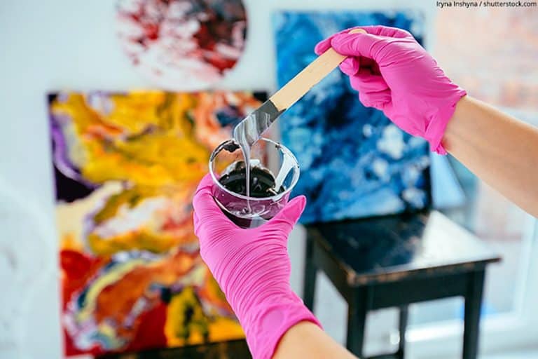
Tips for Mixing Different Shades of Blue
Blue shades are often used to tone down white colors. This can produce unwanted results that match the color baby blue. Therefore, when mixing blue tones, we recommend that you add some black color to gray the shade a bit so that it no longer looks so pastel and toned down. The various shades of blue names each have a unique formula to follow when mixing them.
The Blue Effect
In interior design, the color blue has an important meaning. The color makes the room look open because blue surfaces radiate a certain width. This makes the room look visually wider. In addition, the color appears cool and has a calming effect. The color blue can be combined well with warm tones such as orange, yellow, red, and brown, creating contrasting yet harmonious surfaces. Harmonious moods can also be achieved by combining it with green. Deep blue tones often look very noble and do well on metals.
Understanding the different shades of blue is important for any artists wanting to discover just how much range the blue color has to offer. When looking at the shades of blue names, you will find an enormous list of various colors – each with its own unique character. Working with different blue shades allows for a huge rage of depth and emotion.
View our Shades of Blue web story here.